[include shot of inline logo on handle]
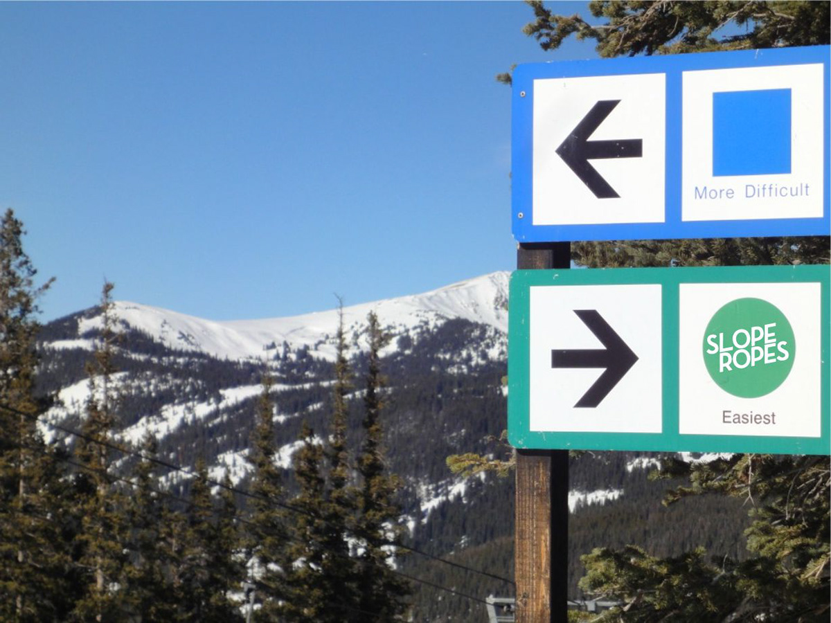
Inspired by the green circle, denoting the easiest runs at a ski hill...
Something about the name and the layout of the word "Slope" lined up on top of the word" Ropes" subconsciously evokes casual passers-by to sound out the name, driving familiarity and recall.
Started with the Neutraface logo, a shout out to Shake Shack, Paula Scher and House Industries, all 3 of which we are huge fans of.
The horizontal bar of the 'L' is extended to ensure that the two words stack nicely in the logo. When used as an inline wordmark, the 'L' is used stock.
The text is placed at a 10 degree angle that both compensates for the italicized font, and nods to the 10 degree slope of the Bunny Hill, the starting place for most skiers.
The green circle of the logo has a keyline the same thickness as the font, which helps it stand out on different colour backgrounds, including the back of the packaging [hyperlink to packaging]